Our Rover product has been in production for about two years now and we continue to expand its features, especially as we develop the full PMS version. When we are in the field selling Rover to new customers, we focus on the core pillars of mobility and usability quite a bit. However, I wanted to take a moment to highlight another core pillar of our hotel management software system – the StayCard.
When the product design team was first trying to re-think the traditional PMS interface, we first focused on real-life front desk interactions. The main challenge was to try to imagine the ideal staff/guest interaction that wasn’t driven by any traditional PMS software interface rules or flows. If the front desk clerk didn’t have to look down and follow the flow dictated by the software, what would the ideal interaction look like?
Well, the hotel business is changing because the concept of service is changing. Personalization and guest recognition are very much in the forefront of the New Service paradigm. It may seem obvious to say that in today’s world, the Guest is King. But traditional PMS software is not really built with that concept in mind. Traditional PMS software is built around the concept that the Reservation is King. Interfaces are focused on the transaction at hand and don’t really support tangential guest information that may drive a more personalized interaction between staff and guest.
The product design team wanted to put the reservation and the guest on equal footing in the software and interaction flow. First we wanted to make sure we had the basic reservation covered. Our earliest ‘sketches’ looked like this:
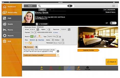
However, we also wanted to make sure we could show rich guest profile information like this:
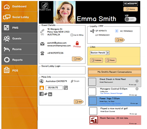
Naturally, the difficulty is that this is quite a lot of information to present at one time. In the ideal staff/guest interaction, the staff member can’t have their head down searching through data. However, we had an advantage over the traditional PMS design – we were optimizing for touch devices. “Swipe” was our friend and so with a single swipe, you could “pull down” the guest profile information over the reservation.
After many more iterations that included the addition of key features and a cleaned up GUI, the product evolved to this:
Before Swipe to See Guest Info
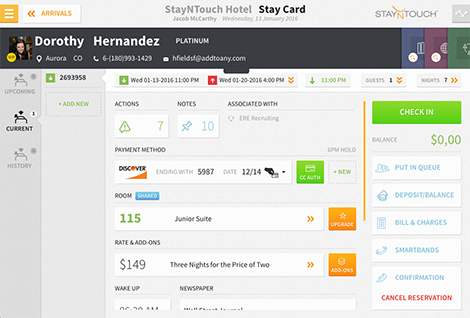
After the swipe to see guest info:

Now the guest info and the reservation are never separate objects. They always ride together. This mean that, in a swipe, the staff member (or even concierge) can access guest history, preferences, past comments etc. which all better inform the staff’s response and service to the guest.
One other important note: Staff members are not the only ones looking at this interface. This is designed for a tablet, where the staff member can share the view of the application with the guest. Sharing via tablet is important to help validate guest information as well as provide visual enhancements to the up-sell and upgrade process. So when the guest sees the application, we want them to see that they are at the top of the page – the most important focus. Plus now that it may be guest-facing, it is part of the guest experience and thus needs to be have consumer-grade visual appeal. This is not your typical dull, gray windows application interface. Color is everywhere.
We call this combined reservation/guest profile the StayCard. It is a core pillar to our software and we think it reflects our customers’ view: the Guest is King.
Read more articles on Hotel PMS, Mobile PMS and Cloud PMS.
